The Consortium
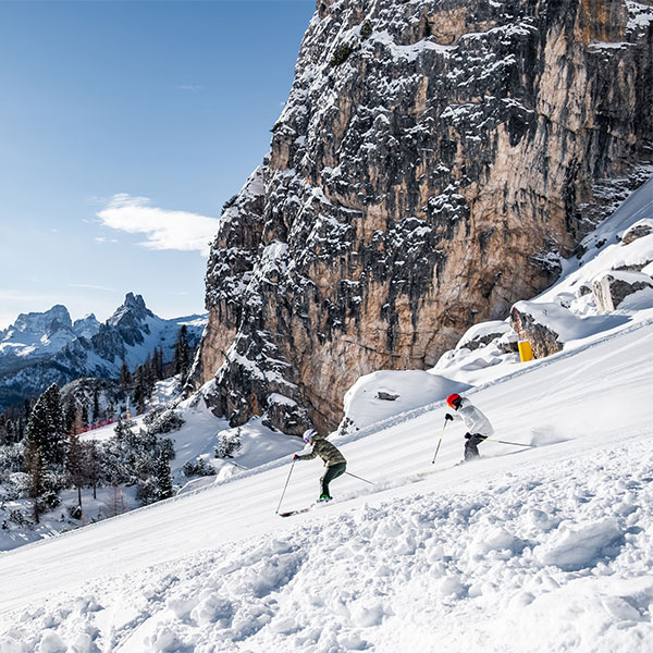
An alpine environment accessible all year round
©Alex De Villa

An alpine environment accessible all year round
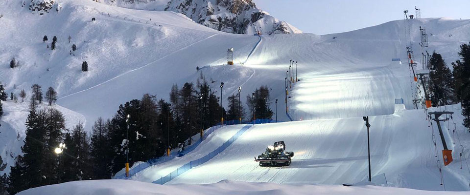
120 km of ski runs
8 companies
35 lifts
95% of snowmaking coverage
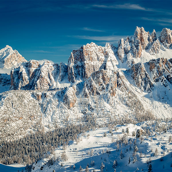
Consorzio Esercenti Impianti a Fune di Cortina d’Ampezzo, San Vito di Cadore, Auronzo e Misurina associates eight ski lift companies located in four different destinations. The ski area is made of 5 ski areas (Faloria – Cristallo, Tofana - 5 Torri - Lagazuoi, San Vito di Cadore, Auronzo, Misurina) offering over 70 skiruns, 13 of which are graded as black slopes, and 35 lift facilities. During the summer, lifts allow tourists to reach the highest summits and experience the mountain at 360° either climbing via ferrata, riding your mountain bike on dedicated trails, or hiking.
Easy access and sustainability are the key missions of the Consortium that, thanks to the companies it represents, makes the mountain accessible to everyone 11 months a year, and safeguards the mountains from depopulation and abandonment and, finally, produces an income for the local areas.
In 1974, Cortina d'Ampezzo contributed to create the Dolomiti Superski area and represents nowadays the top of the 12 ski resorts of what is considered the largest ski carousel in the world: 450 lifts with over 1,200 km of slopes all included in one lift pass.

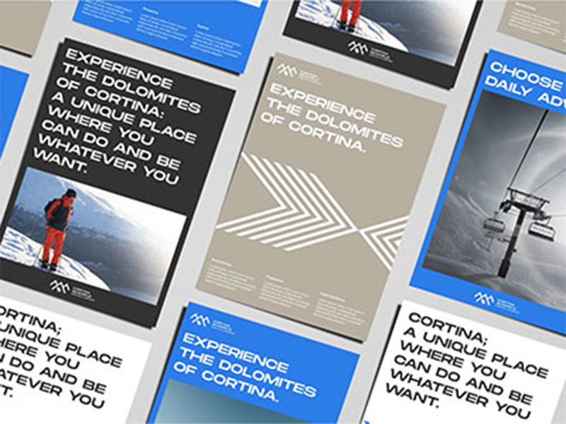
Since spring 2020, the board of directors has defined the guidelines that led to the Consortium's rebranding activity. Six Italian and foreign agencies presented their view: the winner was Nascent Design, an independent design agency based in Milan.
The request to the agencies consisted in the development of a brand image that would emphasize the Cortina "brand" and at the same time be iconographic for the ski areas belonging to the CEIF (Cortina, San Vito di Cadore, Auronzo and Misurina), to all three municipalities, the ski areas and the eight lifts companies. The main goal was to bring the Dolomites to life in its most vertical dimension.
It all started with skiing and that real object of desire that evokes sensations, speed, movement, freedom: the ski pass. A desire that has evolved over time, due to the need and request of users to be able to visit the Dolomites 12 months a year. CEIF and its companies have been able to interpret that change by becoming a company present in the area all year round, well aware that this area represents a uniquess in the world.
Three districts: Cortina, San Vito, Auronzo and Misurina, each of them made of sport, tradition and culture united under a single name. Perhaps that's a coincidence, but the number three was the starting point in the development of the logo. This number has a particular magic in it. In numerology, three is the symbol of conciliation due to its unifying value. Its geometric expression is the triangle, an exemplary symbol of the return of the multiple to unity: two separate points in space, assemble and reunite in a third point located higher up ... the history of the logo starts from here.
Cortina, San Vito, Auronzo and Misurina have a triple identity which nevertheless develops from a common root and value. They are depicted in the graphic sign, a simple and clean line that reminds us of the Dolomites. That's why the color of the logo also goes in this direction, for the Dolomites are mountains full of magic. The sky of the Dolomites with its clear blue color becomes the metaphor of the symbolic embrace that brings together the three areas under a single sky.
The Cortina brand is world-wide famous. In fact, there are few tourist resorts that carry in their heritage a name steeped in so much positive value content. Its combination with international events, from the World Ski Championships to the Milan - Cortina 2026 Winter Olympics only reinforces its value. A name that knows how to welcome, respect and enhance the distinctive and characterizing values of the Auronzo - Misurina and San Vito areas, which contribute to enhancing the breadth of the area and its articulation, going beyond territorial borders, because skiing and sport are above all this.
This is also why the Consortium wanted to present the new logo to the public and the press on the occasion of the Alpine Skiing World Championships, held in the Queen of the Dolomites in February 2021, with a press conference broadcast live on the official channels of Fondazione Cortina 2021 and many events including talks, interviews with the presidents of the companies, and promotional meetings.
Why "Skiworld"? The word "Ski" is easy to understand to identify the lifts and, although it may sound limiting for the summer season, it immediately recalls the "Skipass" which evokes the freedom that only the Dolomites can offer ... regardless from the season. The English term "World" clearly identifies the area as an international destination of primary importance as well as enhancing its breadth and articulation.
In addition to an offer made of sports, events, nature, style and the prestige of the "Cortina" brand, we wanted to give greater emphasis to the area by enhancing the breadth, characteristics and articulation of the offer. This is the value of the territory, a value which is linked to the environment, a value in terms of sporting dimensions, tools for experiencing the mountains, a sense of innovation and a vision of looking ahead.
A limited edition of sunglasses (a co-production between Cortina Skiworld & Frenk, from the Cadore company Glam Srl) was among the first practical applications of the new logo. Why a sunglasses company? Because we wanted to enhance the importance of the "Made in Veneto" that has made this region an excellence not only in Italy, but in the world.
In autumn 2021 the new Cortina Skiworld logo received the prestigious Red Dot Design Award in the Brands & Communication Design category. Established in 1955 with the aim of honoring the exceptional quality of designers and manufacturers, the Red Dot Design Award is one of the largest and most important design awards in the world and attracts more than 10,000 entries from 60 countries every year.
